For most business owners, ordering a sign is something you do once every ten years. You aren’t an expert in acrylic grades, LED lumens, or municipal zoning codes—and why should you be?
Unfortunately, this lack of experience often leads to expensive mistakes. A business sign is a significant investment ($5,000 – $15,000+). If you get it wrong, you are stuck with a 500-pound metal object bolted to your building that either looks bad, doesn’t light up right, or (worst case) has to be torn down by the City.
At R&R Signs, we have fixed countless signs that were designed or ordered poorly by other shops. Here are the 7 most common mistakes we see business owners make—and how to avoid them.
1. Buying Too Small (The “Paper Scale” Problem)
When you look at a design proof on a computer screen or a piece of paper, a 12-inch letter looks huge. It takes up half the page!
But when you bolt that 12-inch letter onto a 20-foot tall building facade, and view it from a car 100 feet away… it disappears.
The Fix: Signage is viewed from a distance. A good rule of thumb for readability is 1 inch of letter height for every 10 feet of viewing distance.
- If you want drivers to read your sign from the freeway (300 feet away), your letters need to be *at least* 30 inches tall.
- Don’t guess. Let us photoshop the sign onto a photo of your building to show you the true scale.
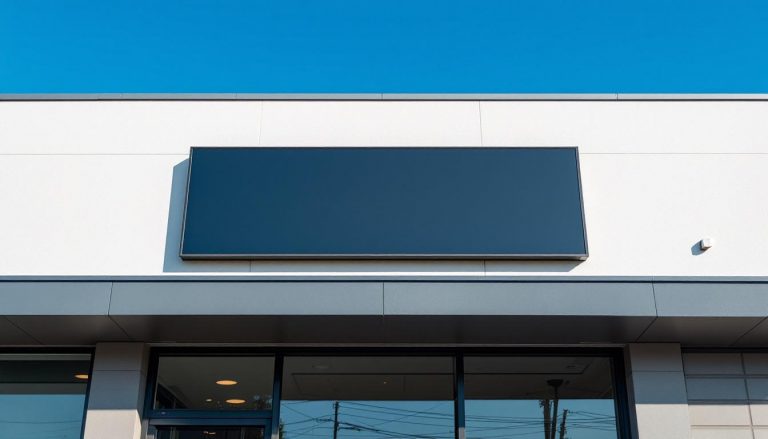
2. Low Contrast Colors
You love your logo. It’s a beautiful navy blue text on a black background. It looks sleek on your business card.
On a building sign? It is invisible.
At night, or even on a cloudy day, low-contrast color combinations blur together. “Tone-on-Tone” designs (Dark Grey on Light Grey) might look “designer,” but they fail the primary job of a sign: Readability.
The Fix: High contrast is king. White text on a dark wall. Black text on a light wall. If you must use dark colors on a dark building, add a white outline (stroke) or a white “backer panel” to pop the letters off the background.
3. Using Too Many Words
- *Bad Sign:* “Johnson & Sons Family Plumbing, Heating, Air Conditioning, and Drain Cleaning Services of Glendora – Est 1982 – Call 555-0199”
- *Good Sign:* “JOHNSON PLUMBING”
Drivers traveling at 40 MPH have approximately 3 seconds to read your sign. If you clutter the sign with a menu of services, phone numbers, and slogans, the brain ignores it all as “visual noise.”
The Fix: Your building sign is for Branding, not Information. Put the phone number on the door vinyl or the website. Keep the building sign to just the Brand Name.
4. Ordering the Sign Before the Permit
We have seen this tragedy too many times. A business owner orders a sign online to save money. The sign arrives. They hire a handyman to install it.
Three weeks later, the City of Glendora Code Enforcement issues a citation. The sign is too big for the zone. Or it projects too far. Or it’s the wrong color for the “Specific Plan” of that street.
The business owner has to pay to remove the sign and buy a completely new one.
The Fix: NEVER fabricate a sign until you have a stamped, approved permit from the City in your hand. R&R Signs handles the permitting process for you to ensure this never happens.
5. Ignoring the Wall Surface (The Halo Trap)
Halo-lit channel letters (which glow from behind) are beautiful. Everyone wants them.
But if you install them on a glossy tile wall or a glass window, you don’t get a soft glow. You get a reflection of the ugly LED bulbs inside the letter. It looks broken and cheap.
The Fix: Halo-lit signs require a matte, non-reflective backdrop. If your building is glossy tile, we need to install a matte backer panel behind the letters first.
6. Going Cheap on Materials (The “Fading” Red)
Red is the first color to fade in UV sunlight. If you buy a cheap sign made with standard vinyl or low-grade acrylic, that vibrant “Coca-Cola Red” will turn into “Pepto-Bismol Pink” within two California summers.
The Fix: Ask for high-performance, automotive-grade translucent vinyls and UV-resistant acrylics. It costs 10% more upfront but adds 5 years to the visual life of the sign.
7. Forgetting Maintenance
A sign with burnt-out letters (reading “HOTEL” -> “HOT “) is worse than no sign at all. It tells customers you are neglected and dirty.
Many business owners treat signs like “set it and forget it.” But LEDs can dim. Power supplies can fail. Birds can build nests.
The Fix: Use a local sign company (like us) that offers service and repair. If a letter goes out, we can often fix it in 24 hours. If you bought the sign from an online wholesaler in Florida, good luck getting a service tech to come out.
Do It Right The First Time
Signage is permanent advertising. A great sign pays for itself by bringing in customers every single day for 10 years. A bad sign costs you customers every single day.
Avoid these mistakes. Work with a licensed, experienced local manufacturer. Contact R&R Signs for a free consultation and let’s build something that lasts.